Graphic work for Redemption is always a massive undertaking. Gabe has faithfully led the work for many years, ensuring the quality of final cards is impeccable. From 2022-2023 we released Israel’s Deliverance starter decks (100 cards), Israel’s Rebellion (129 cards) and Redemption Roots (224 cards). Not to mention the fundraiser cards, Promos, and the Israel’s Deliverance Nationals edition and bonus cards.
That’s a ton of work for one person! The exact discussion is a little fuzzy, but somewhere along the way I suggested that I could assist with the next set. I had an idea that I could create “base level” graphics without art (by far the most time-consuming part of graphics) to allow us to dive into deck-building and real games earlier in the process. I’ve helped the graphics process in minor ways over the years, finding art, creating alternative borders for Cloud of Witness’ and Revelation of John.
I knew the basics for manipulating the template, and thought I remembered most of the details for things like set icon placement, gradient on multi-brigade cards, limits for font sizing, etc. Boy was I wrong!
As I undertook the graphic design work for Inheritance, Gabe came alongside and mentored me, taught me, and reminded me of things I should have known and forgot. To say there were bumps along the way would be an understatement, but hopefully the final product lives up to the high level and standards that Gabe has set. Along the way we also learned new ways of doing things, and had some of the best team collaboration that we ever have.
I knew right away that art finding could no longer be contained solely in the hands of one person. Each Elder picked a brigade and hunted down art for it, I love how this gives each brigade its own unique feel. Some are more cohesive than others. Chris in particular did an amazing job and found art almost entirely from one artist (Jean Leon Gerome) for his brigade.
We also explored new and exciting tools like Artificial Intelligence (AI) image generation. I know there’s certainly some strong feelings around AI art at large, and within our community. I don’t intend to debate or offend, I’ll simply say that for a small game with a limited art budget, with a team composed solely of volunteers, AI is a valuable tool. If you’ve made it this far you’re 400 words in without a single spoiler, so here’s the first for you!
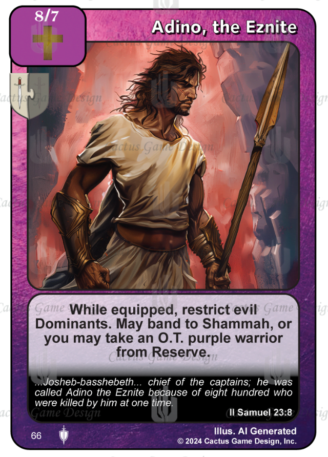
This is the final version of Adino. Let me tell you, this guy was a struggle! I believe this is the 5th or 6th iteration of art for him. All of the David’s Mighty Men use AI art, including the support cards. Getting all of them looking the same was important to us.
Era appropriate art for biblical warriors is among the most difficult to find, especially since almost every set has a bunch of cards that need it, and we’ve worked our way through most of the high quality public domain stuff. Certainly getting 12 characters (11 Heroes + a bonus DAC) all in similar style would be nigh impossible without the use of AI.
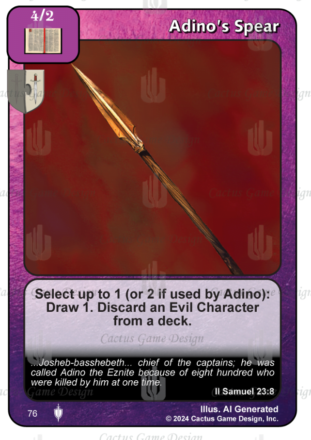
AI also allowed us to do some really cool things with the weapons in this set, making some of them appear in the named character’s art, and then highlighted in the weapon art, like so:
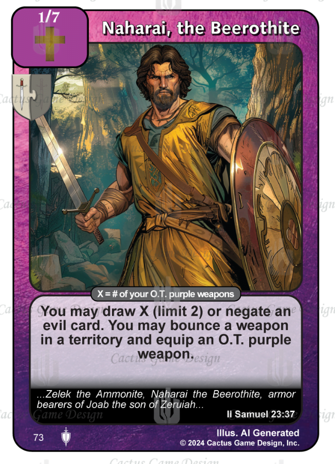
We have a series of “Signature” weapons in Inheritance, where you get a choice between two abilities, unless you can sync it up with the named warrior, in which case you get both! Purple definitely has a “Weapons matter” theme, with plenty of ways to grab them from deck, reserve, or discard. There may also be a way or two to relocate them from one warrior to another, like on this guy:
What a powerhouse! We all know Tyler designed this ability. Just kidding, it was actually Gabe! Naharai got reworked part way through development to help support the “Weapons matter” ideas with a strong draw, and the weapon relocation. I call it relocation, but I’m sure savvy players will find other cute things to do with the bounce and equip.
How many weapons will you need to maximize the strategy? A quick search of lackey tells me that there’s 7 existing purple weapons in rotation. We will almost double that number with Inheritance, you saw Adino’s Spear above, and I’ll tell you there’s 3 more ‘Signature’ weapons in purple alone. During playtesting getting the Warrior to Weapon ratio right was one of the hardest things.
They were my favorite theme for a few reasons. I’m excited for players to start experimenting with them. Naharai proved to be incredibly strong during testing with “Weapons matter” so we had to lower the limit on his draw down to 2.
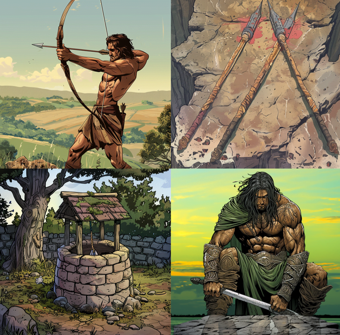
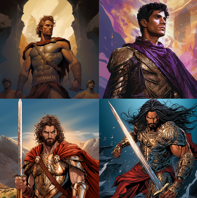
Our use of AI as a tool also came with its share of learning curve and opportunities. Almost none of the Mighty Men went to print with the same art they started with. Early versions all ended up looking a little “Roman” or “SuperHero” Here’s some examples:
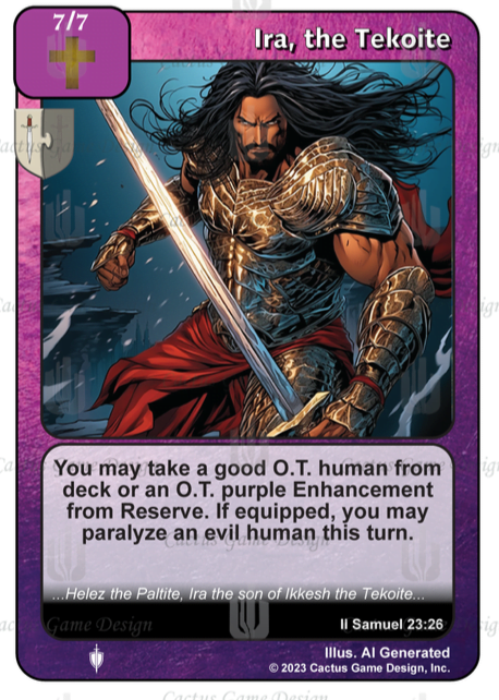
The bottom right guy is a little bit of both! This is what he looked like on the card:
Very Aquaman right? We all really liked this art, and when we did our initial rework, we kept him like this. Upon further reflection we decided that he was going to stick out as the only one. So I went back to our generation tool and got this:
I really wanted one of the Mighty Men to dual-wield swords, I just thought it would be super cool, I also tried to get them with different color schemes. There were times that our AI generator gave amazing pieces with a single prompt and some slight tweaks. Others took me 10+ prompt generations and reworks.
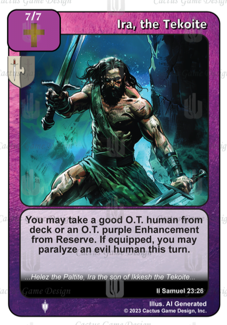
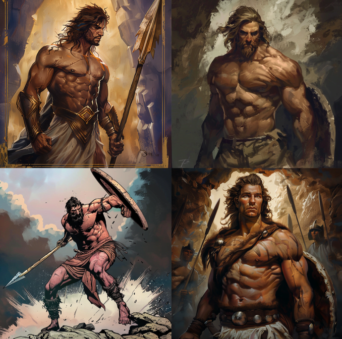
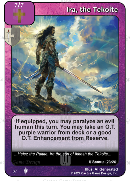
This version of Ira was the latter, I simply couldn’t get him to look heroic. Around the time that I was working on Ira we had a playtester bring a concern to us around the Mighty Men art. We had moved on from the Roman armor above, but in so doing ended up with a bunch of guys showing perhaps a gratuitous amount of muscle:
We consulted with some members of the community, some of the married Elders showed the art to their wives. We prayerfully considered the matter. The overwhelming feedback that we received was similar to this: “They’re probably okay, but it might not be a bad idea to cover up some if possible, also Ira looks evil”
So I went back to work again and created new art for a handful of the cards, and used creative photoshop skills on some of the others (Top left above was the 3rd version of Adino). I also completely went back to the drawing board on Ira, and finally ended up with this, the final version:
Note also that the ability changed slightly during playtesting to make him more theme specific, rather than an OT splash enabler. You might notice that this art was previously spoiled as Tyler’s profile pic. I wonder what other Mighty Men might be out and about already.
Working on the graphics for Israel’s Inheritance was at times difficult, frustrating and exhausting. I want to extend my personal thanks to the team and their supreme patience with me as I learned the ropes and navigated the mistakes I was making along the way, including having to redo virtually every card early on because of a formatting error I made.
Ultimately being the lead graphic designer for this set was amazing, special, fulfilling and rewarding. I am so incredibly excited for everyone to see the collective efforts of our incredible team.
I was told I had to keep this article to 4 spoilers, but there’s simply so many amazing David’s Mighty Men pieces, so here’s a bonus collage of art that did make it onto cards. Enjoy!
To buy singles, sealed product, and other gaming supplies mentioned, please visit our sponsors!
