Last week in part 1 I focused mainly on cards that didn’t see print for one reason or another. But it’s not just cards that get cut. Sometimes the card still sees print but certain aspects of the card don’t make the final version. We strive to have the coolest looking art we can on the cards but that isn’t always easy. With a limited art budget to work with we need to be creative to keep things looking great. As a result one of the most common aspects of a card to hit the cutting room floor is the illustration.
In the early stages of set design we grab any cool pic we can find, many of which won’t see print in the final stages because they aren’t legal for us to use. In some cases we reach out to the artist in hopes we can obtain the rights but more often than not that doesn’t work out. We start by settling for the first free piece we find that is decent and works with the scripture and continue searching if it’s not something we’re happy with.
When our first piece for Angelic Army fell through we used this piece for a while. We also toyed with the idea of reusing the illustration from Angel of Deliverance before we settled on what would eventually become the printed illustration.

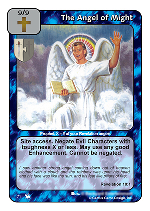
Angel of Might didn’t always have the resued art from Liberating Angel. Initially he used a piece that was drawn to depict exactly what is described in the passage. The problem is that the portion of the picture where he’s standing on the land and sea gets cropped out and you end up with a jolly looking guy with a rainbow over his head.
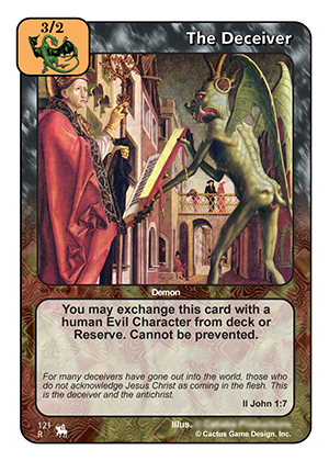
This next illustration definitely depicts a demonic figure attempting to deceive a believer making it a good fit for The Deceiver. The odd illustration with a face on the figures back side got him affectionately nicknamed “butt face” during testing. In the end, we knew this card would be heavily played and didn’t feel the art really did it justice. When we realized the art was available from an old warriors card Number of the Beast we quickly swapped it out.
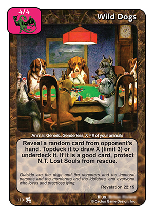
It’s not difficult to find a public domain picture of dogs. When Wild Dogs was initially introduced to the team we had an adequate illustration to use. Someone jokingly suggested that we use the classic picture of dogs playing poker. I mocked up the card and a few of us really liked it! Throughout most of testing this is the illustration we used. It’s one that people either loved or hated but we planned to go with it until we stumbled upon a piece that was too perfect not to use. But who knows, maybe some day we will still use this illustration on a “dogs” card.
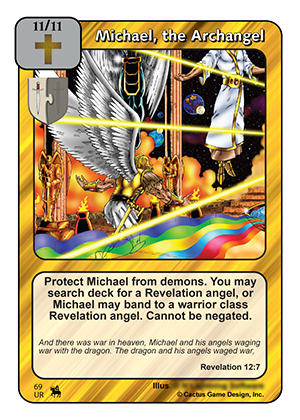
We struggled to decide on the perfect piece for Michael. The classic illustration on the Warriors and Kings version is great making it difficult to find something new to use that would be remotely close by comparison. We had a few unused pieces that depicted the same character used on the previous versions. But when we decided to make him ultra rare it was clear the piece we had was not good enough. Since the package illustration was already decided we went with the same illustration making Michael an iconic figure in the set in more ways that one.
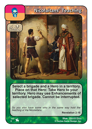
It’s pretty easy to find art for a can like Nicolaitan’s Teaching because there are a lot of things you can make work. It wasn’t until towards the end of our testing that the piece your familiar with was seen on facebook by one of our team members. Had he not stumbled across it this is what the card would look like today.
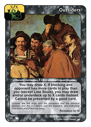
Outsiders is another card that lends itself to a broad application of illustrations. The first Outsider we made used this illustration and was affectionately called “cowboy” by some. In the end we didn’t really care for the illustration in this context so we found something different to use.
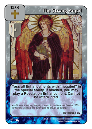
When we reprint a popular card in a new context we prefer to give it a new illustration. We hoped to make the RoJ reprint of The Strong Angel a viable option so we wanted it to look different. But finding a piece that was close to being as awesome as the original was quite a bit more challenging that you might think. We didn’t initially have access to some of the unused pieces from the pool the original image came from so we tried this illustration for a while. Once we found the piece your familiar with depicting the same character in an action shot it was an easy decision to switch.
I hope this has been a fun glimpse for you behind the curtain at some aspect of making RoJ. If you have questions or there is anything else you’d like to know about please let us know in the comments below. Maybe you’ll inspire myself or one of the other set developers to write a “Cutting Room Floor – RoJ: part 3”.
To buy singles, sealed product, and other gaming supplies mentioned, please visit Three Lions Gaming!
Derek
I’m so glad you guys didn’t go with the Angel of Might art! I couldn’t see myself taking the card seriously, or show it to a new player!