Earlier this week Travis previewed the new Noah’s Ark promo for us. If you haven’t seen that yet be sure to check it out.
There are a lot of decisions that go into making a card. Sometimes they are easy. Other times they aren’t as cut and dry. We were pretty well decided on what Noah’s Ark will do long before Cloud of Witnesses went to print. But there was one rather large aspect of the card that was undecided right up until a week ago.
It wasn’t the special ability, the name or the card type. It wasn’t the awesome art that we commissioned from Doug Gray. So what was up for debate so late in this card’s development?
The Border
For most of Redemption’s existence promo cards have received the same gold border as ultra rare cards. We’re all used to this and it looks pretty good. You know when you see that lovely gold that you have something special in your hands.
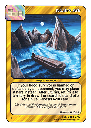
Last year Rob surprised us and changed things up a little bit with the National promo. On demand printing gave him the opportunity to try out a fancy new promo border on Glory of the Lord in Tennessee. We also tried the “Redemption sword” border on Noah’s Ark.
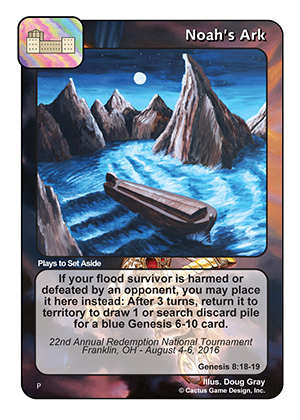
Knowing that we can experiment and try new things we also sampled a colorful border that depicts the ark at the end of its journey.
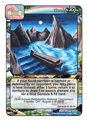
These were the first three options we entertained. As with most art, it’s a matter of personal preference. Every option had at least one fan and there wasn’t a clear cut winner.
While some people liked the “Redemption sword”, others felt it was too dark when combined with the darker piece that Doug created for us. The idea of lightening the sword image was brought up so we took it to the Photoshop.
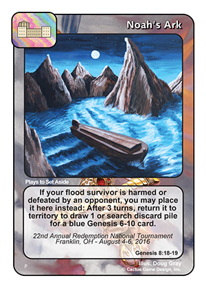
The sword images certainly had the biggest following after this, but we were still split about 50/50 between the dark and light versions.
In true American fashion we decide the answer was more choices so we gave ourselves another option.
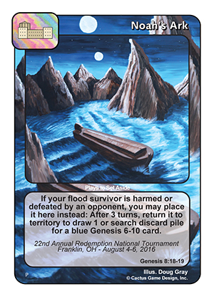
Using the card art as the border is only a jump away from using the “Redemption sword” from the card back. It certainly works better for some cards than it does for others. It doesn’t look bad on this card, but is it amazing enough to win out over our other options? Not this time.
That did make us wonder, what does Noah’s Ark look like in borderless?
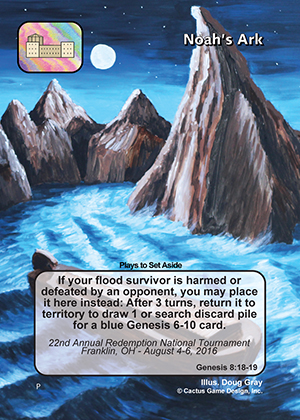
It’s hard to get a true appreciation for the beauty of borderless from this image because of the excess art that’s needed for cutting the card at the printer.
What about full art?
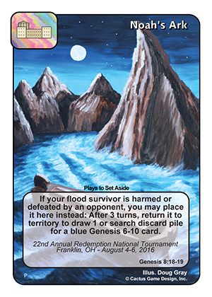
Both the borderless version and the full art version both suffer from the same problem – the centerpiece of the card, Noah’s Ark, is hidden behind the text box.
Doug’s art was not designed with full art or borderless in mind. The way the ark is placed in the picture is just doesn’t work for this card. We could move the text box, but we felt that looks kind of silly.
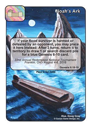
After viewing all these options, several of us were very happy with either sword border. A few highly preferred the white one. I think we would have been good with any of those first four options, but I’m happy with the choice we made. The freedom to explore these different options gets me excited for some of the cool things we might be able to do with Redemption cards in the future.
And that, ladies and gentlemen, is a peak behind the curtain. Not everything that goes on behind the scenes has to do with making up special abilities and play testing cards. Sometimes we get to decide how to make things look cool too.
To buy singles, sealed product, and other gaming supplies mentioned, please visit Three Lions Gaming!

John David Cunningham
The one with the rainbow is tasty, but my favorite is the finished product 🙂 What a great commission. Such cool vibes! Beautiful!
Jonathan Gomez
Honestly I love the last card with no boarders, super cool. The rainbow one is also really awesome. That being said, I think the design you guys finalized with is great too. We’ll done.